In February 2019, colleagues and I have started building design system for Baemin, the #1 food and lifestyle mobile platform in Korea. The first version of it was on the company's web based products, such as desktop and mobile store managing tools and educational content pages for 250k+ food and restaurant entrepreneurs who partnered with Baemin.
Parts of this project was translated into English to help explain the design process.
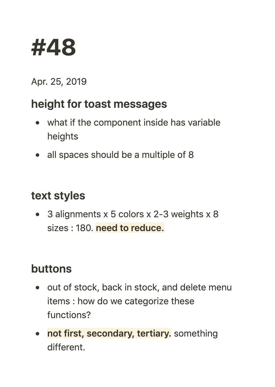
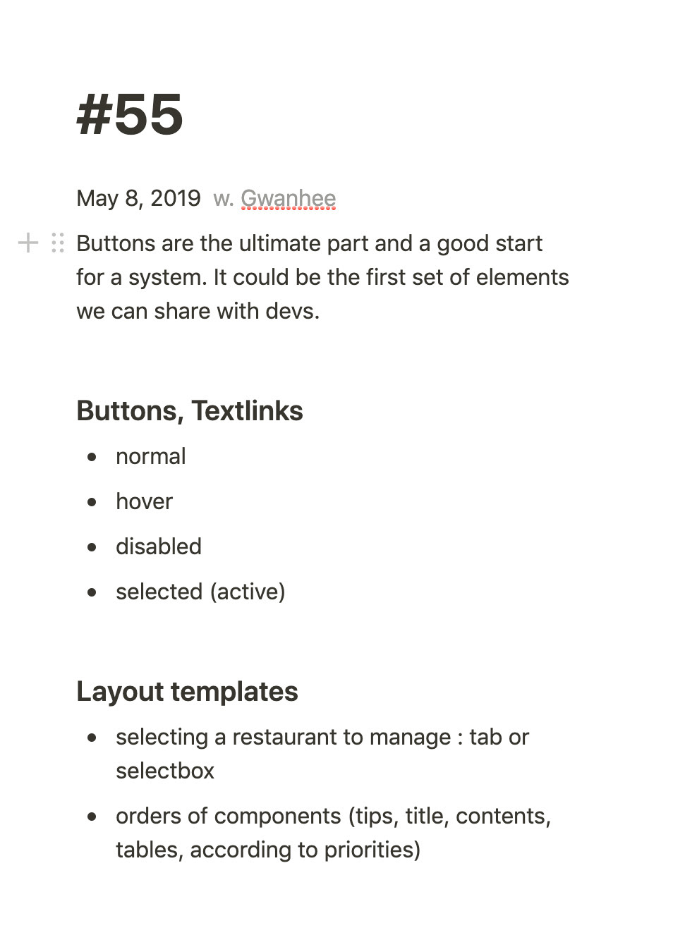
Since buttons appear on most pages, it took us very long to come up with a complete set of buttons. We first thought it would be the starting point, but it ended up changing until the very last stage.
Having multiple 'depths' in one page was also a challenge. Stylistic changes such as underline or colour seemed like a quick solution for one instance, but they did not always translate well into other pages, creating more misalignment. We realized changing or rewriting CTA text actually removed the issue in many cases, as well as reevaluating the decision to have buttons in the first place.
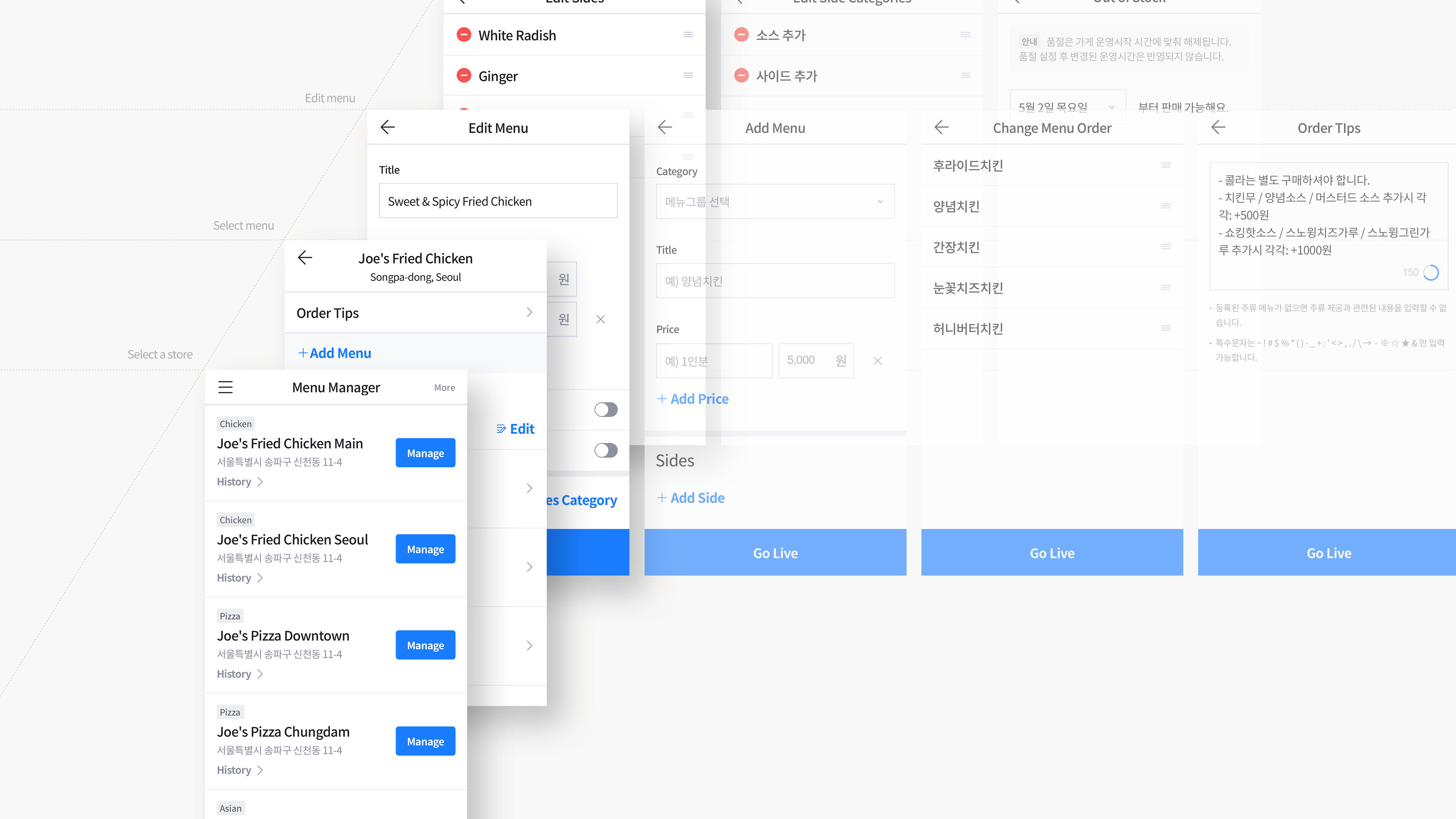
To our surprise, each restaurant menu and their customization options varied so widely. Special drinks only available upon orders of large pizza, less popular menus they want to 'hide' instead of 'delete', a semi-franchise store that wants to customize their menu from the headquarter company but still want the updates to be synced. Things that never seemed to be a problem when each store came up with their own printed menu. Frustrated restaurant owners called the customer service, which often came in as design requests to change or add the number of select box and filter types literally every month. Regular overhauls on menu types and the data structure in the backend were critical.
Documenting was more important than expected.
Since each designers had ongoing projects to meet immediate business goals of the company, building and applying design system to an existing product felt like this complex Howl's moving castle that has small ongoing (and often conflicting) projects inside. Agile communication with developers was essential, and sometimes creating multiple versions of layout (the legacy version to roll out first and the new system version for later release) was also inevitable. The point was keeping things up to date while not killing the entire system - this is where documenting and recording played a crucial role.
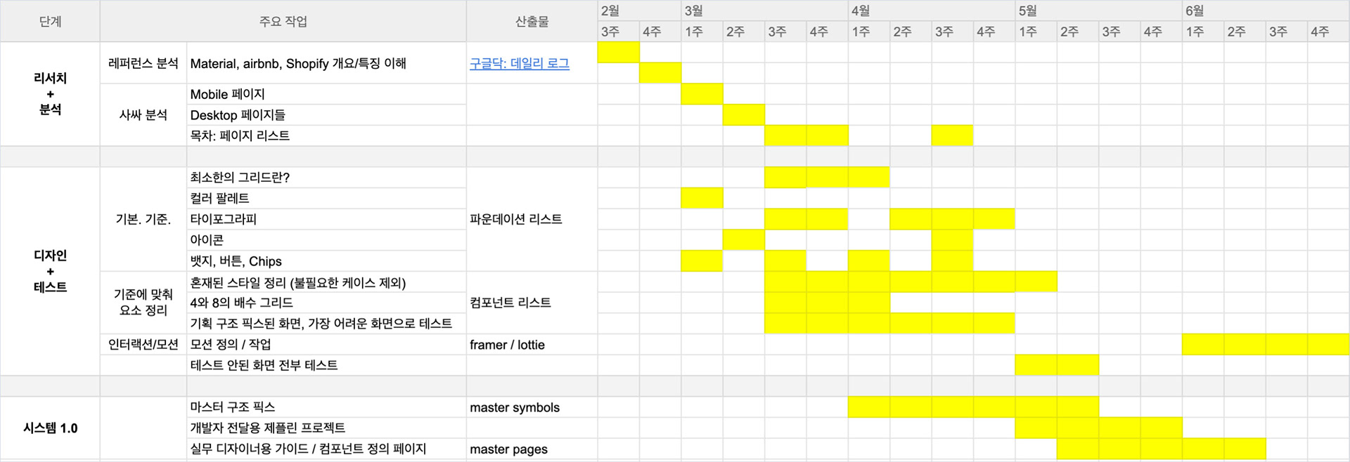
Original work plan written in February. Yellow cells represent how the actual project unfolded.
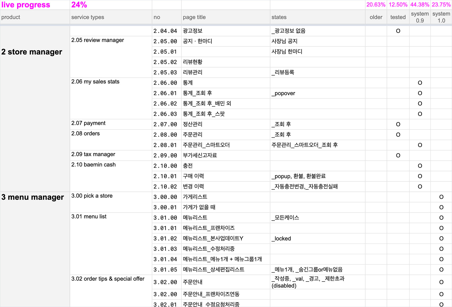
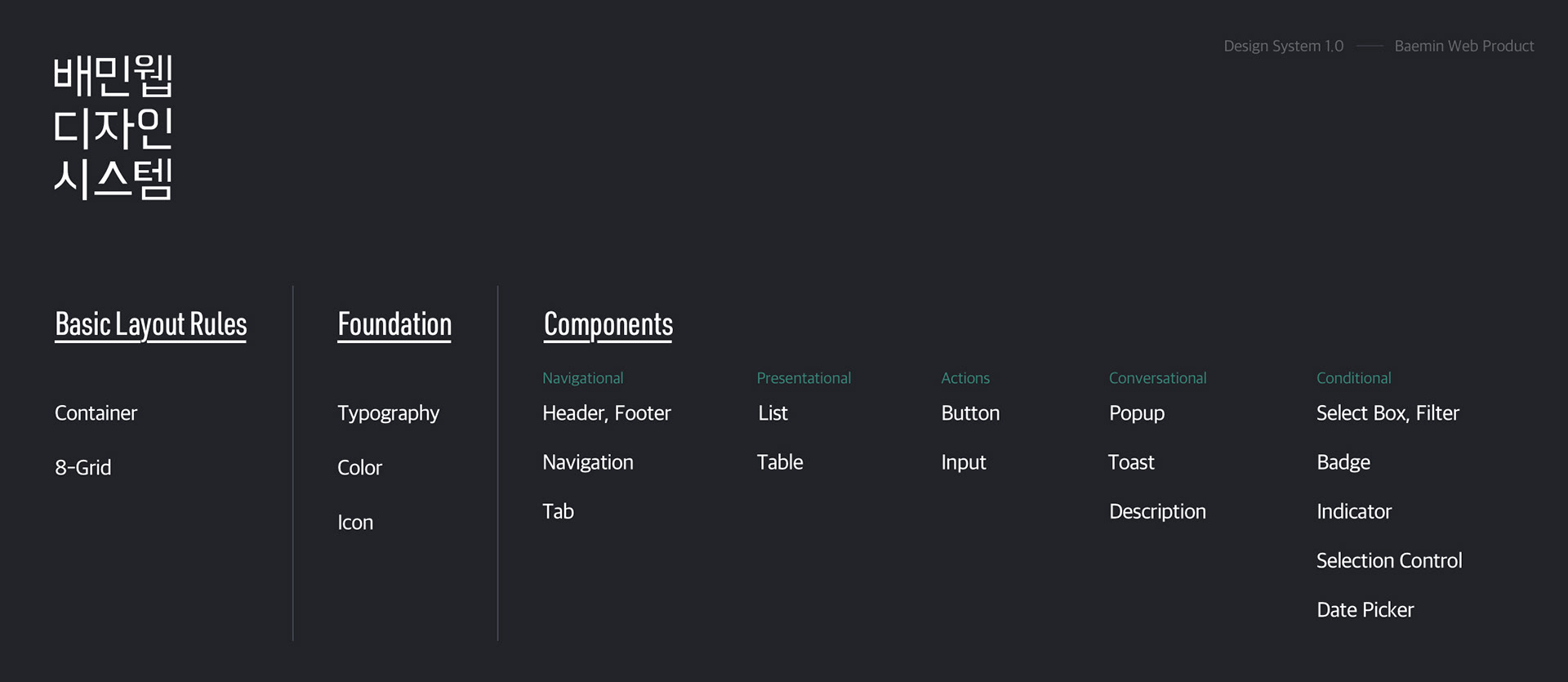
Page inventory list. This also worked as our real-time progress marker.

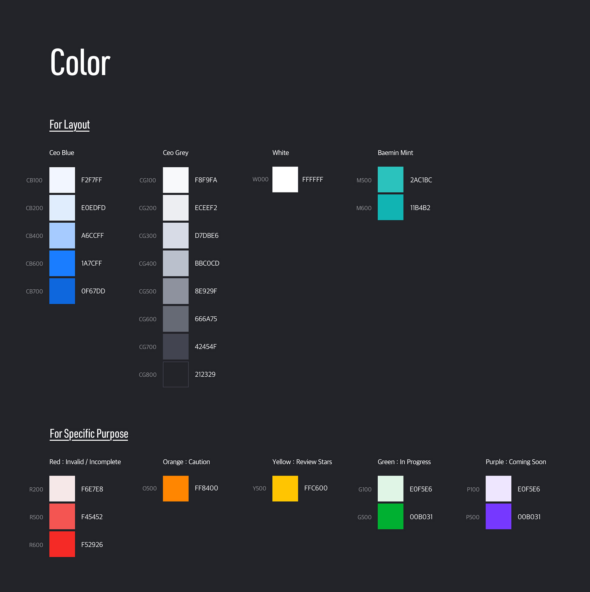
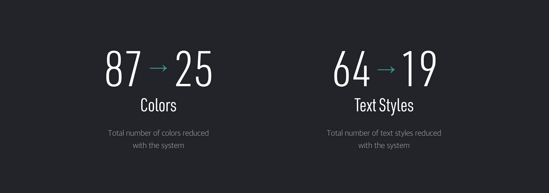
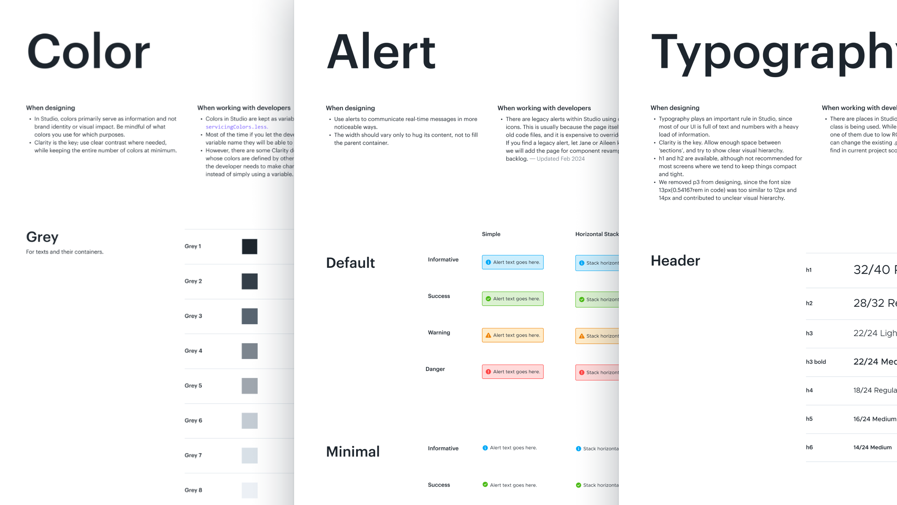
With the system, 73 colors were reduced to 13.
1-hr daily meeting journal.
1-hr daily meeting journal.
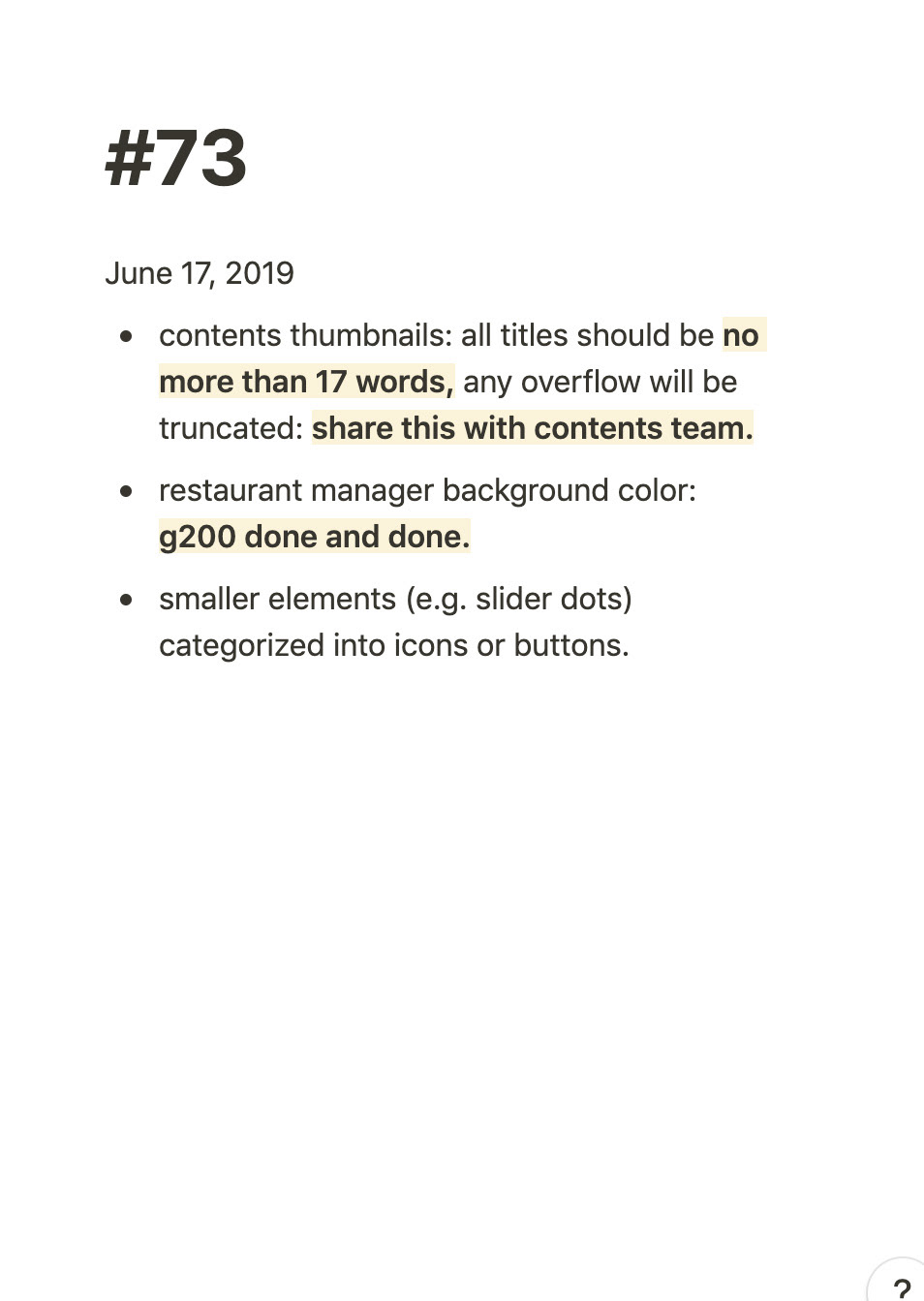
1-hr daily meeting journal.
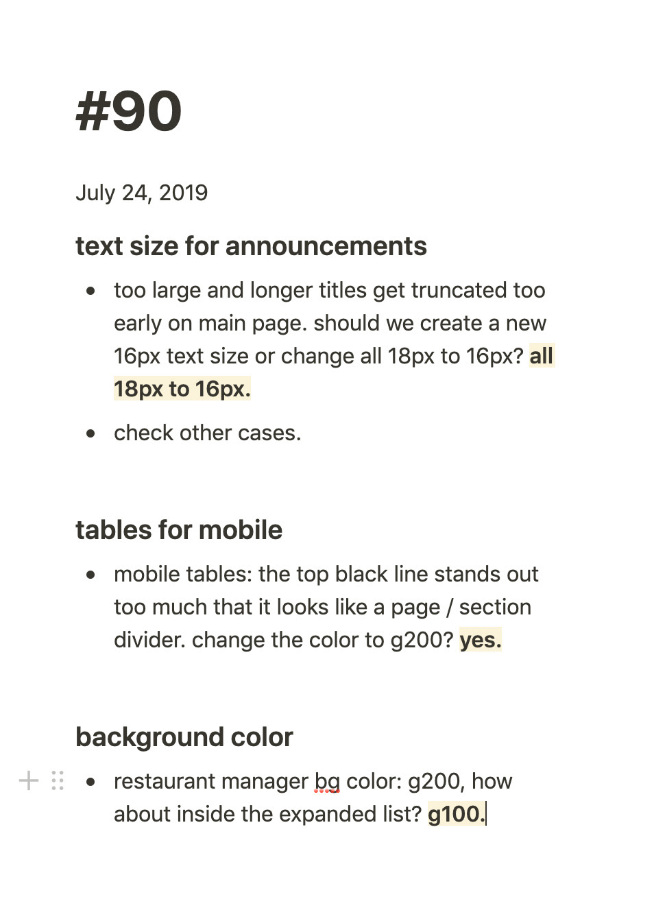
1-hr daily meeting journal.
Numbers That Count.
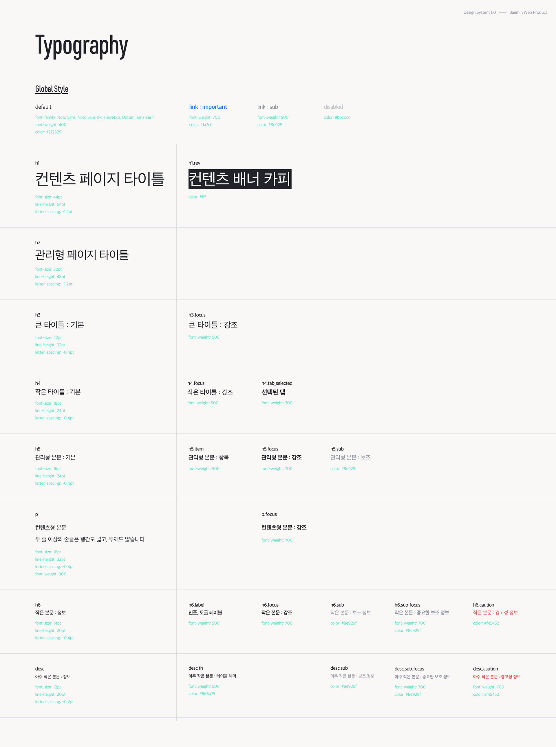
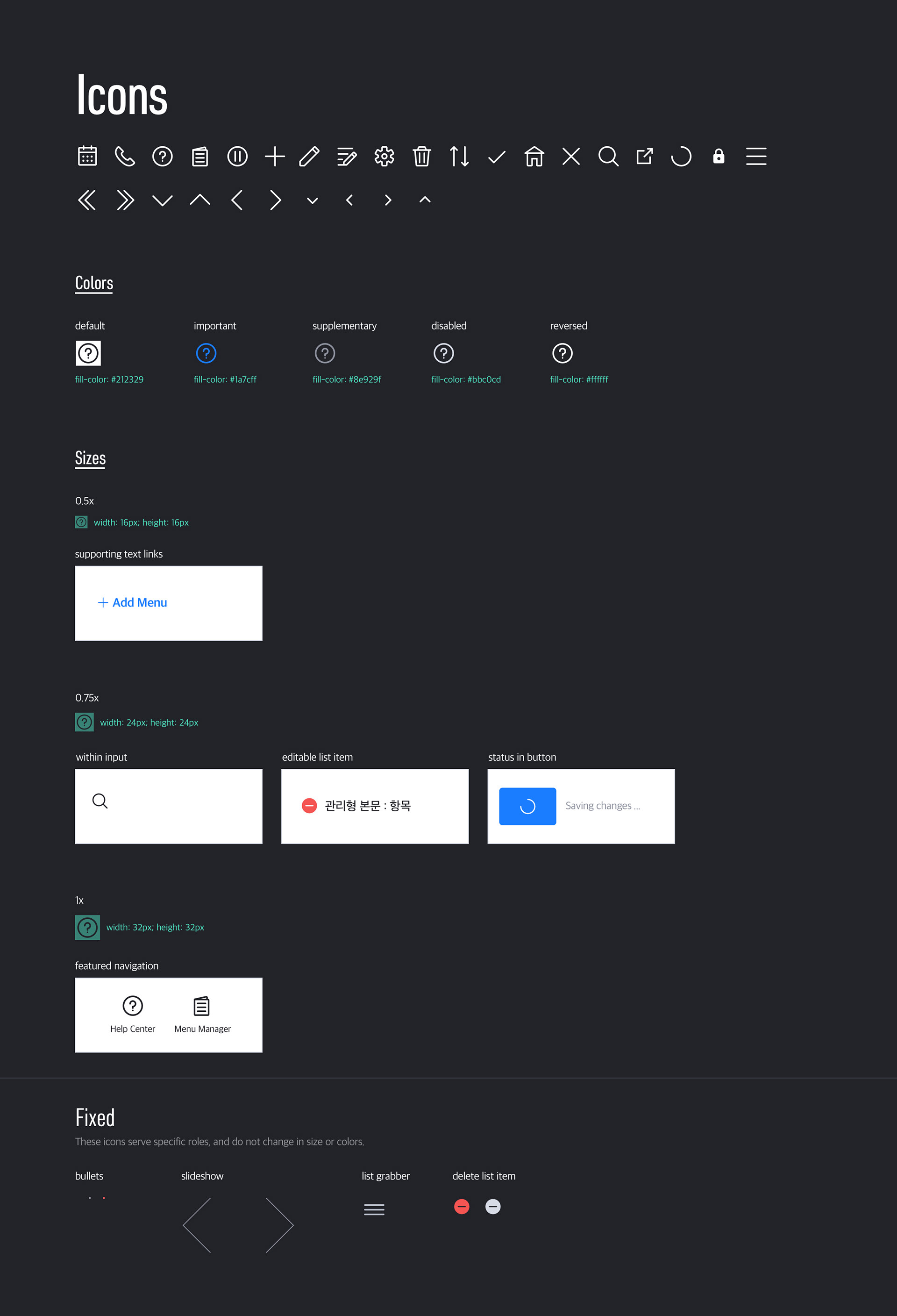
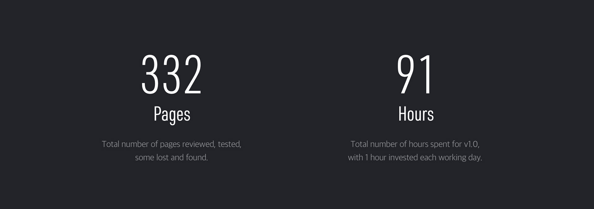
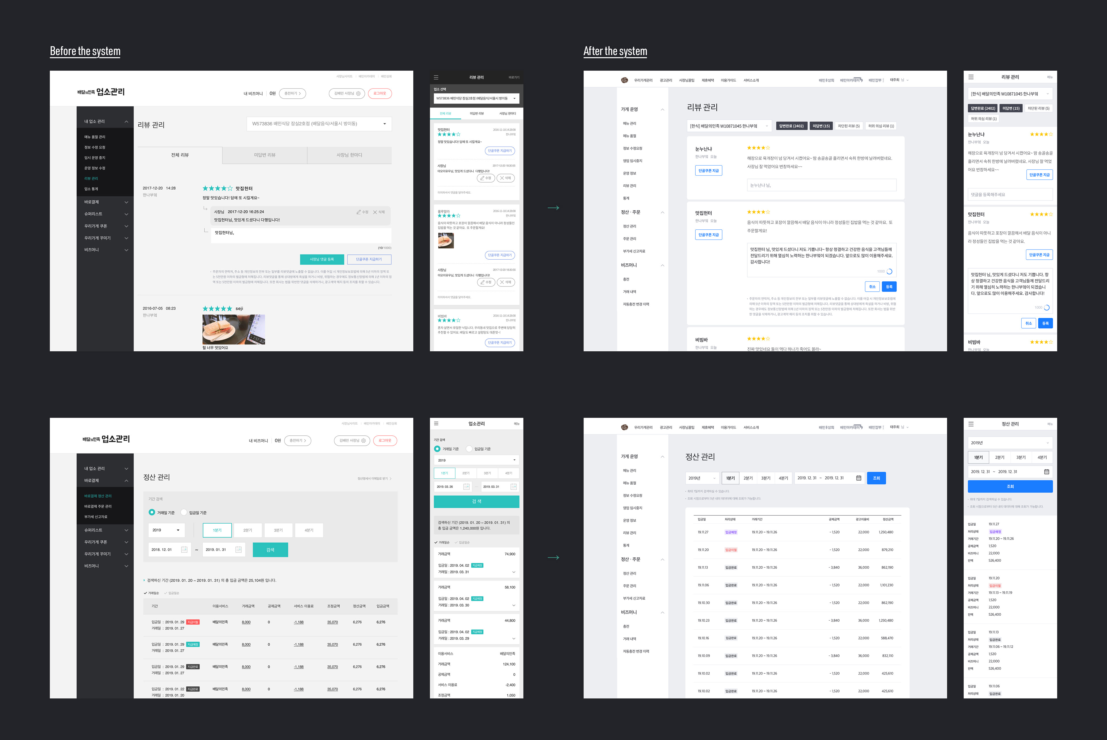
With the application of the system, total number of colours has reduced from 73 to 13, and text styles from at least 90 to 25. There were 332 web pages to cover, and more than 82% is now tested and ready-to-go with the new design and layout.
Real Application.
As of December 2019, system's master library is being shared with designers from four different teams through Abstract. Developers have now joined the project and building a live UI library. The goal is to create a ubiquitous pipeline for all, so any project manager can pull off elements to build their sketches and designers can publish new updates.